8 Actionable Tips for Improving Your Search UX and Usability


Improving your website’s search feature is one of the most underappreciated things you can do to improve your site’s user experience. Whether you own an e-commerce business, are running a blog, or maintaining a corporate website, on-site search allows a visitor to get things done.
In e-commerce, a search box makes it easy for customers to look for products they want to buy.
For a blog, it allows a reader to look for the particular post or types of content that has to do with a single topic.
As for a corporate website, on-site search allows a prospect to look for more information they need. And, this might be the quick nudge they need to strike a deal.
If your site has hundreds or thousands of pages, it’s relatively quicker for users to search for a specific page that they want to visit rather than comb through your page directory.
Why Improving Your Search UX and Usability Matters
According to Forrester Research, 43% of website visitors immediately head to the search bar on your e-commerce website. Searchers are more engaged and are 1.8 times more likely to convert than non-searchers.
To optimize the whole process and make searching products seamless, the search interface should be:
- Interactive
- Easy to use
- Aesthetically pleasing
All of these elements make customers more engaged and improve conversions.
In this post, we'll walk you through the eight actionable tips on how you can improve your site's search usability.
Evident Search Bar
If prospects can't browse to find what they're looking for on your site, they should be able to search for it. However, if users need to actively search for your search bar, your UX needs work.
It would be ideal to design a search bar that stands out. Doing so can help increase your searches up to 439%!
It doesn't mean, though, that you should go over the top. While using a bright red rectangle with bold text will undoubtedly capture the user's eyes, it won't likely give you the first impression that you want.
That's why you should pick a search bar that will complement your site's overall look and feel while still being obvious the first time someone sees it.
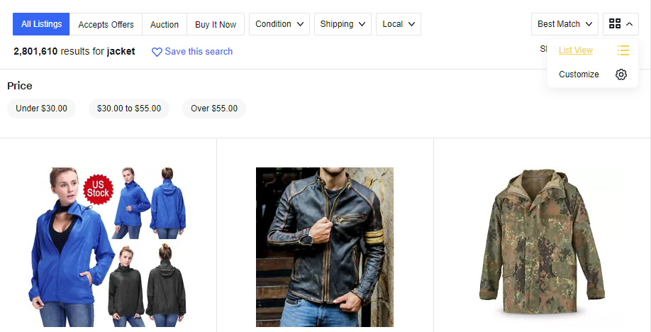
Enable Filters
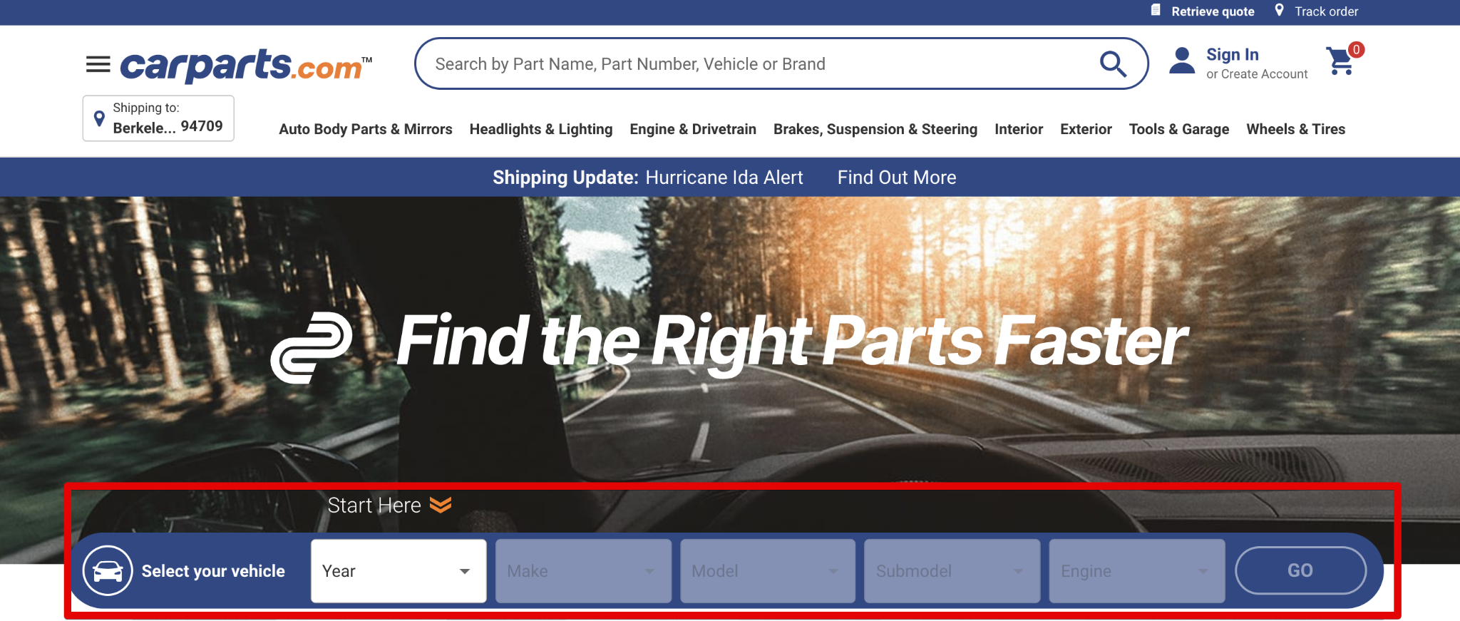
For sites with thousands of records, you may want to help site visitors narrow results by enabling filters from the get-go. For instance in the example above, it has the name, model, category, etc, filters. Only after you complete the filters can you do a free-form search.
Faceted search is another type of filter. They are dynamic and can change based on the context of the query.
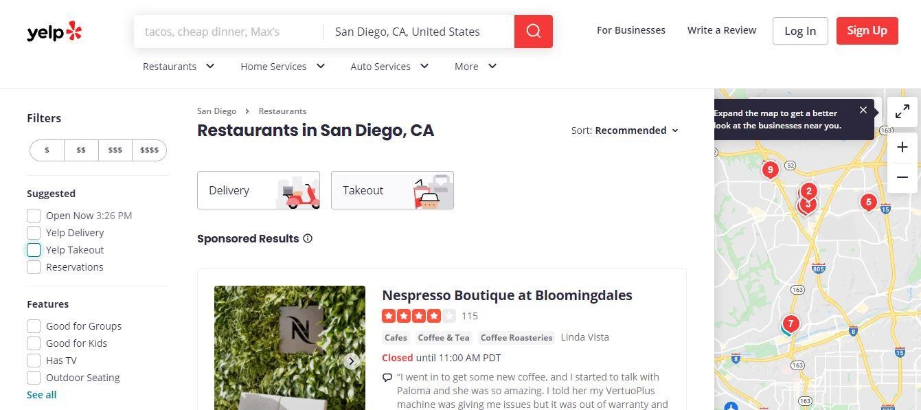
Yelp is an excellent example of a website that uses faceted search. Whether you are looking for a plumber, restaurant, or minority owned business, this search feature makes it easy to do so. From there, you can drill down your search based on various factors like distance, business hours, job type, and more.
You can read more about the differences between facets and filters on this post.
Contextual Search Snippets
Contextual snippets can help searchers narrow down results further.
At first glance, site visitors may wonder how relevant the results are to their queries. This is where contextual search snippets play an important role.
Contextual search snippets are excerpts that showcase how a result is relevant to your query. Think of it as something similar to the meta description you see on Google search results. When a user sees how relevant a search result is, it will compel them to click-through and engage more on your website.
Result Highlighting

Making search results pages visually more appealing can help visitors make sense of results. Thus, the results page plays a crucial role in whether a user will continue consuming your content or not.
Using bold fonts, HTML5 <mark> tags, or CSS background colors is a nice touch and lets visitors find the most relevant content in a block of text immediately.
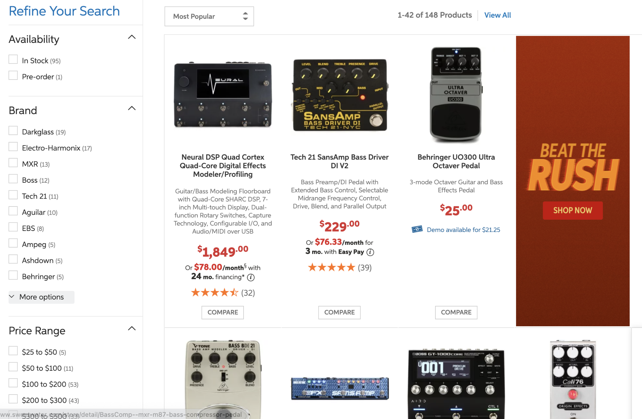
Optimized Search Results Page Design
There's no one-size-fits-all approach when it comes to optimizing a design for the search results page. Nonetheless, it’s good to consider various factors like your target audience, product offerings, and use cases.
Here are also some of the things that you might consider:
Grid View vs. List View
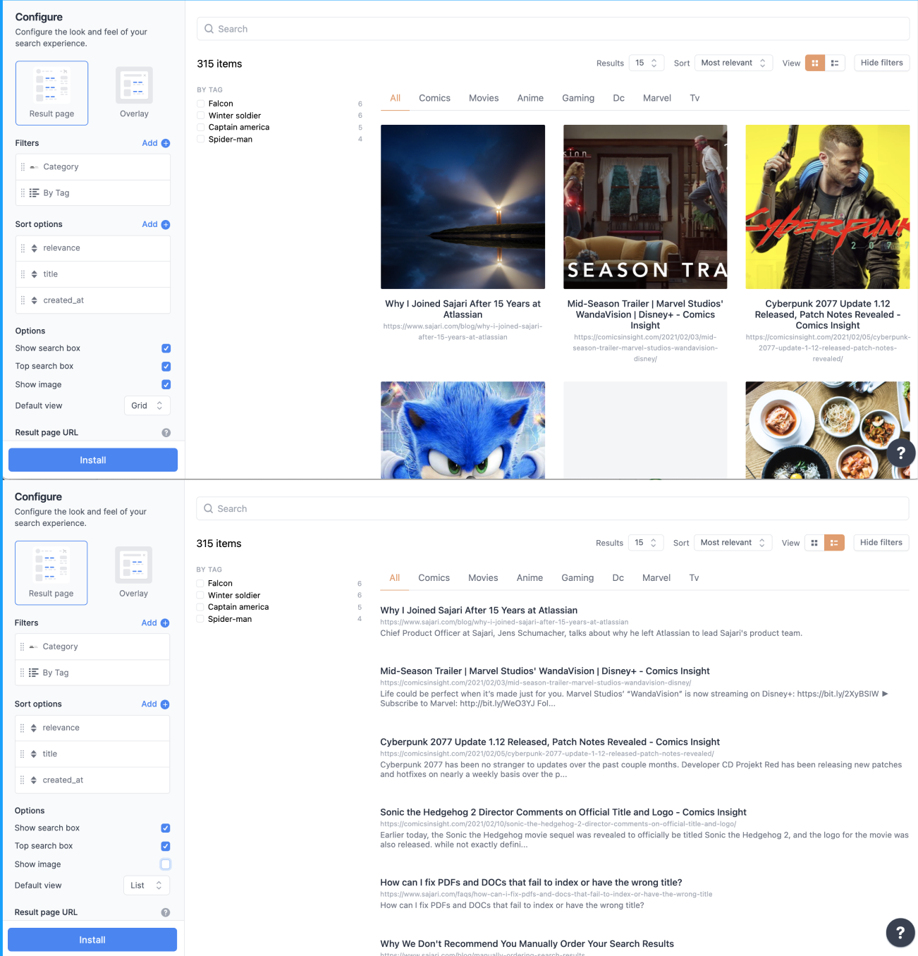
For highly visual e-commerce sites in particular, a grid view is preferred over a list view. However, this would depend on the content as well as the image quality. If you have low-quality images or you’re selling a product that doesn’t require image previews, a list view might be better.
Companies such as Sajari (see screenshot above) offer a UI designer to easily flip between a grid or list view.
Scannable Results Page
When design is easily scannable, it's easier for users to get important information from your products or landing page.
To have a results page that's easily scannable, you can do the following:
- Make sure product descriptions and titles are concise and informative.
- Put a preview or a snippet of the content right below the header.
- Highlight essential keywords and terms in the results.
- Provide a preview of the content on search results.
- Let the users see search result snippets as they type.
- Ensure that every outcome is labeled clearly.
Mobile devices often have smaller screens and content that should easily fit in. Doing so will make it easy for your site visitors to consume your content, regardless of screen size.
Breadcrumb Trail
Similarly, placing a bread crumb trail in your site search results can significantly improve your UX.
As we've previously mentioned, filters offer a great way for visitors to narrow results. However, if someone wants to clear out filters or go back to a previous result, a breadcrumb trail can help.
Adding a breadcrumb trail is like a mini-navigation that sits on your search results page. This makes it easy for your customers to go back to a couple of steps with only a single click.
Search Microcopy
This term "microcopy" or "micro-copy" refers to small chunks of text on a website that guides users to take specific actions or gives them suggestions on how to use a particular interface.
These are particularly useful in a site search because it allows users to think how to search. This significantly reduces the "no result" rate when you set the expectation of what the site contains. This eventually increases site navigability which can improve your brand image and how the user perceives your site.
Autocomplete and Interactive 404 Page
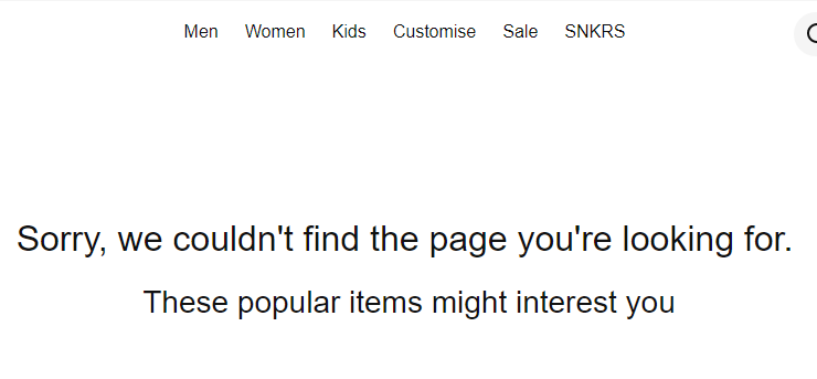
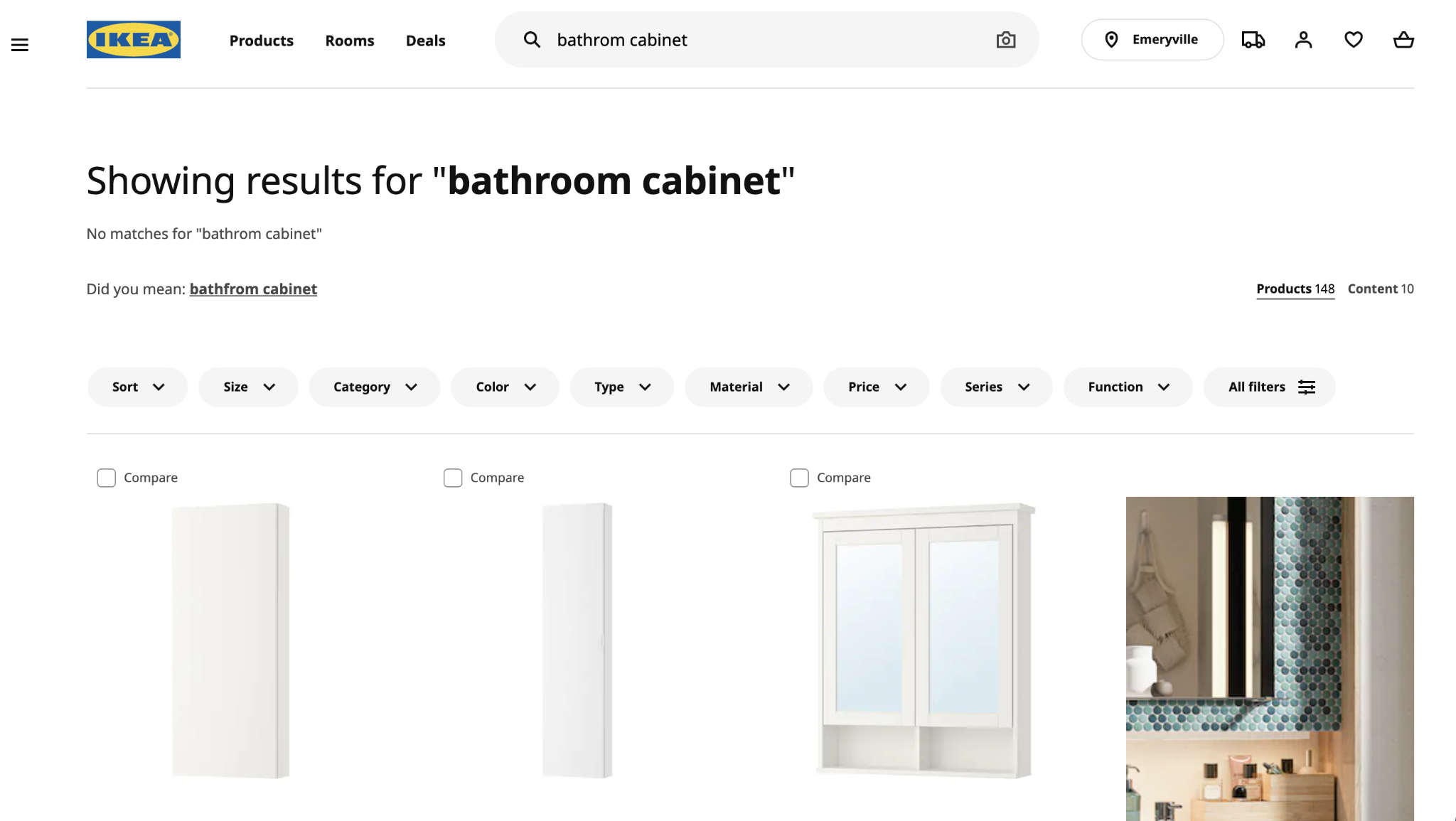
Dead ends can kill your site's UX, and they're a lot more frequent than you think. 34% of e-commerce implementations don't provide valuable results if a user mistypes even just a single character.
Usually, the term "no results matching your search" is like slamming a door in customers' faces.
You don't want to stick a dead-end to customers simply because of a misspelled word.
For misspellings, what you can do is integrate search tools with excellent fuzzy search capabilities. Doing so allows you to correct misspellings automatically or provide a “Did you mean” query in search results.
You can also use autocomplete, which will suggest correct spellings to the users, or have a "no results" page which provides information that brings value to customers. This includes recommended or relevant products.
Learn more about how to avoid no-results searches.
Over to You
To provide users with the best customer experience, it is imperative that you leverage UX web design. Doing so ensures that you make it easy for your customers to do their tasks. And it will help you to boost your conversions and sales.
By following the search UX and usability tips listed above, you can make product search a breeze for your customers and drive your online business's success.
About the author
Kenneth Sytian is the owner and CEO of Sytian Web Design Philippines, a web development and design company. The company boasts more than 15 years of industry experience, developed over 1,400 products, and specializes in creating high-quality and SEO-friendly websites.

.jpeg)
